Redesigning & A/B testing business opportunity cards for better connection quality
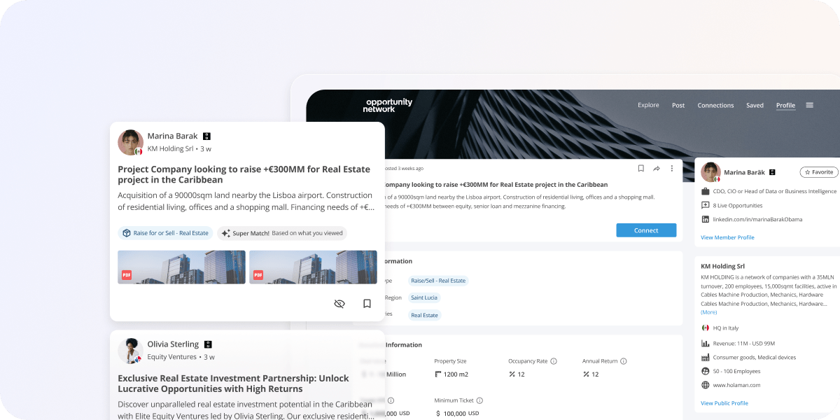
Our users were most frustrated by the fact that they couldn't assess compatibility with other users before connecting. There was a significant mismatch between members and business opportunities, leading to a decrease in the platform engagement.
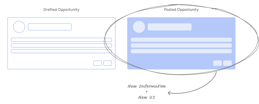
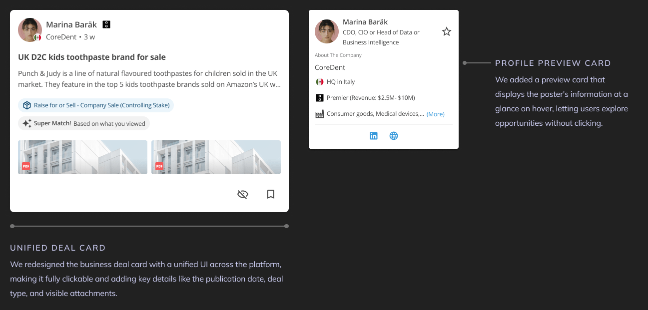
Integrating the newly collected detailed information (from the new posting flow) into the Opportunity Card to make it more trustworthy & increase connection rate among users.
We knew from continuous user research such as interviews, Account Managers feedback, and direct observations that a quite a lot of number of users experienced high frustration when connecting to opportunities only to discover they didn’t align with their needs, undermining trust and platform value.
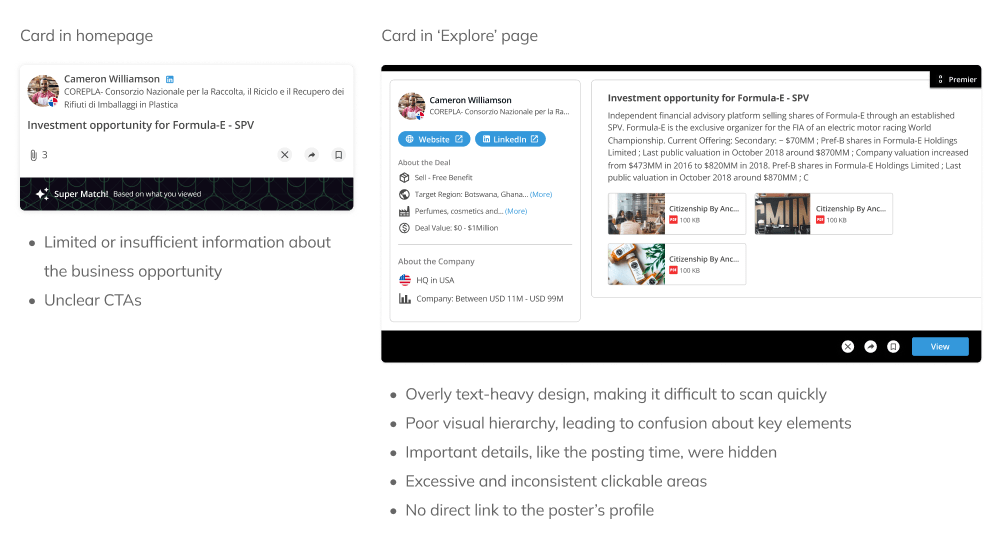
We also recognised several opportunities to improve the deal cards —not just by enhancing their visual appeal, but also by making their content more accessible and easier for users to scan when browsing them on the platform.
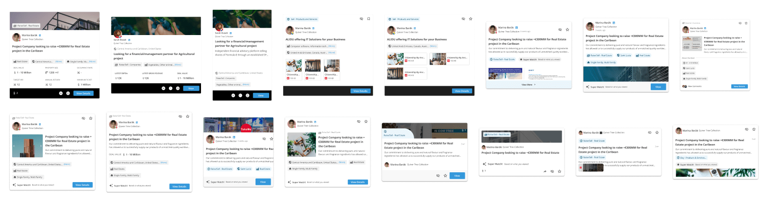
Areas of improvement (Original UI)
During the discovery phase, we aimed to identify the types of information competitors displayed in their cards to keep them relevant for users, as well as to gather references for our new UI.
After discovery, we explored many approaches to include the new information while still addressing UX issues in the cards. We later conducted usability tests with AMs for validation.
We often skipped the wireframing stage as this proved to be a more efficient approach for testing
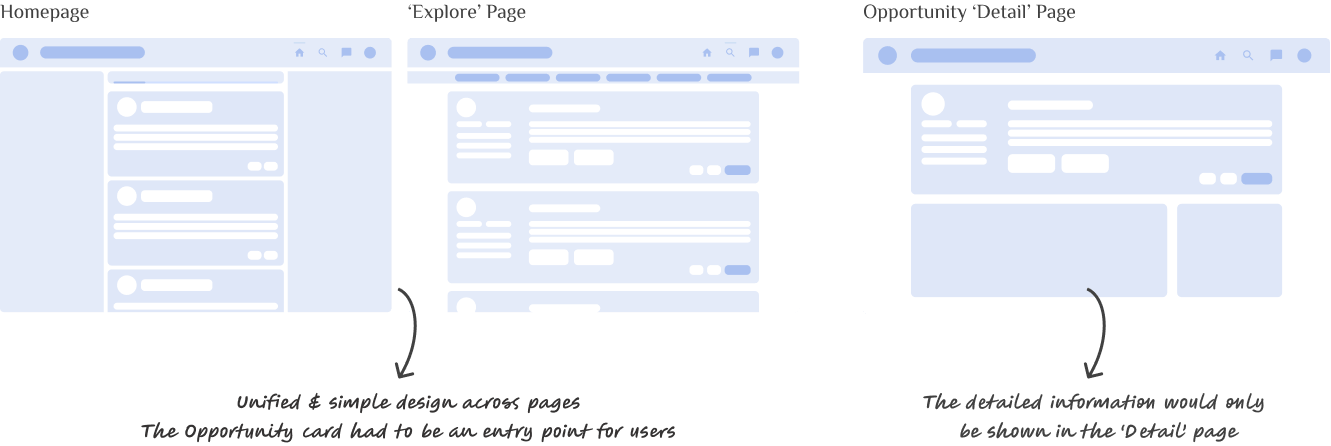
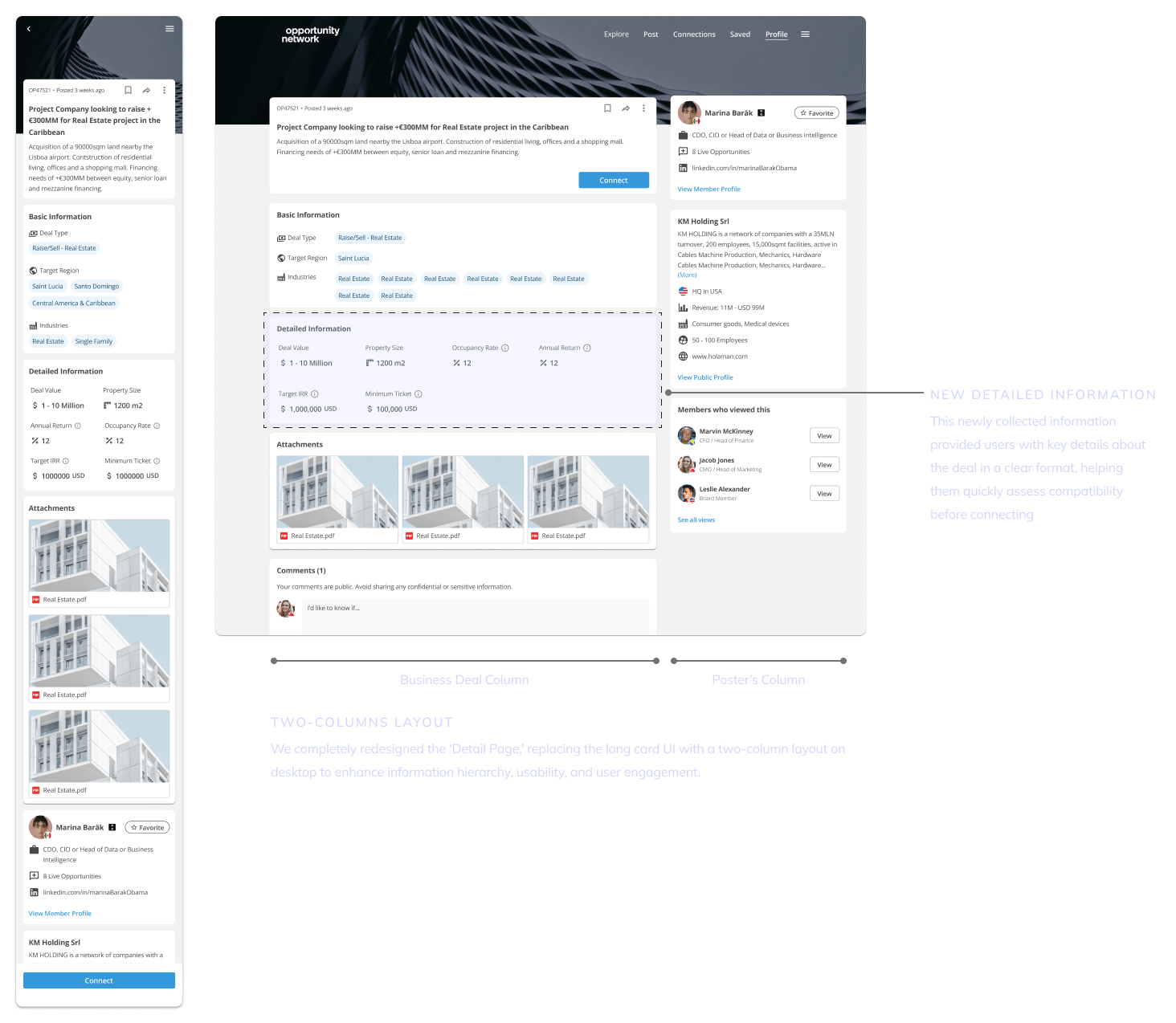
Including the 'Detailed Information' in the opportunity cards was not an easy task since the homepage and the 'explore' page featured different deal types simultaneously. Displaying multiple deal types, some with detailed information and some without, would have created a very confusing user experience.
All of the changes we made aimed to reduce the efforts of the users when trying to find a potential connection to their business needs. We tried to keep a clean and simple design presenting only the most essential information at a glance.
After numerous attempts, we concluded that the new 'detailed information' could be presented on the opportunity detail page only.
New Business Deal Card
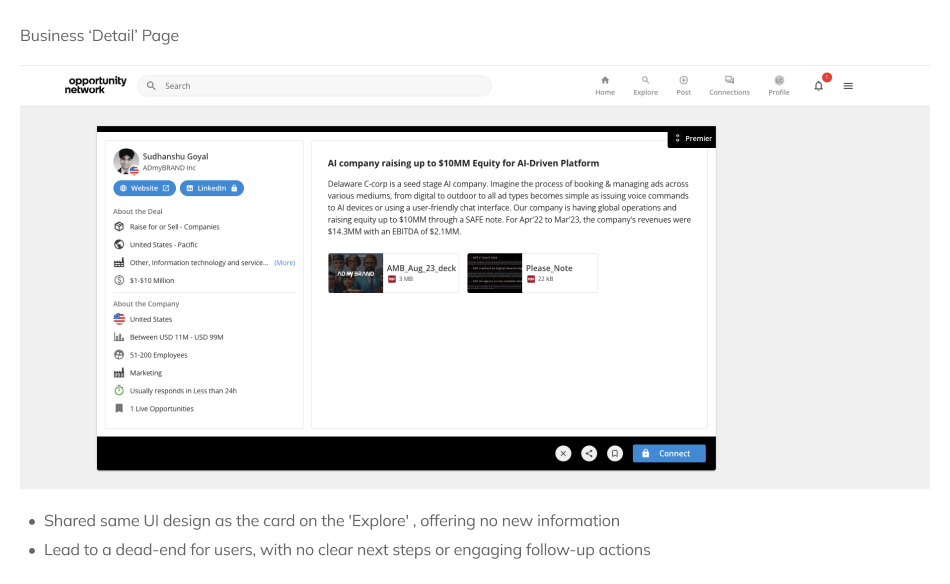
New ‘Detail’ Page
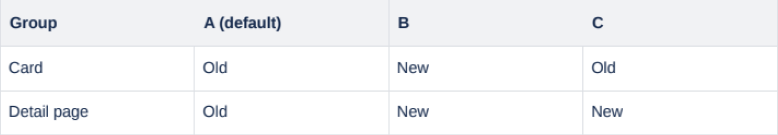
We A/B(/C) tested the new design to learn whether the new designs for the Opportunity Card and Detail Page improved user engagement compared to the default versions.
The main challenge of this project was turning a text-heavy, inconsistent card into a simple, visually engaging, and user-focused entry point.
Due to a shift in the product strategy and the departure of the entire team in July 2024, this project was discontinued before completion.
We measured the click rate/views on the opportunity cards (old & new) & the overall performance of the Detail page (old & new). These were the results of the new design:
+36%
Connection rate
x2
User Profile Views